The Timeline shows your family's migration on a map, year by year.
The first version added pins in the year each person was born. That showed when a place first came into the tree, but not where anyone lived. Someone born in Norway in 1840 stayed a pin in Norway forever, even after a census put them in Wisconsin.
The new Timeline counts people instead. It recently replaced the old one for everyone.
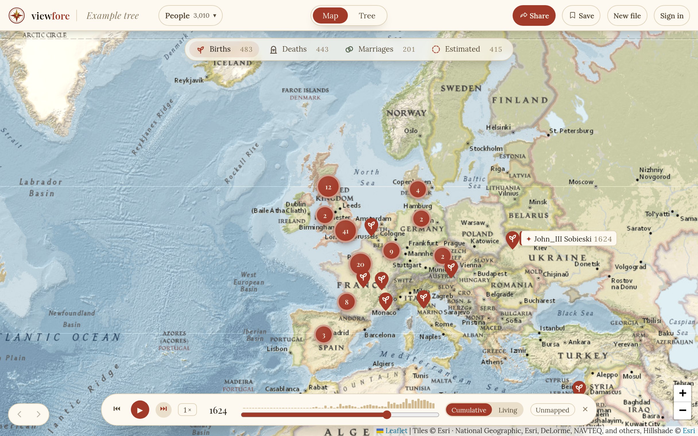
What you see
Each circle is the people alive that year, at the last place a record puts them. A birth, a christening, a census, a residence, a marriage, a child's birth, an immigration, military service, and a death all count as records. Circles grow and shrink as people are born, arrive, move on, and die.
An arc is a move between two records more than 60 km apart. A small ring marks the place they left. Click any arc to see the two records it joins.
One sentence at a time runs in a strip at the bottom of the map, saying who moved and from where to where. Text stays in the strip. It never floats over the map.
Key moments
Some moments matter more than others. The earliest record in the tree is one. So is the first of the family to cross an ocean, two lines joining in a marriage, and the birth of the person the tree is built around. Viewfore finds these in the records and marks them as diamonds on the slider.
When playback reaches one, it stops. A card opens and the journey draws itself on the map. Playback carries on after a short pause, or press Continue. Click a diamond on the slider to jump straight to that moment.
Long stretches where nothing changes play faster, and the strip says "Quiet years, skipping ahead."
At the end, every move in the tree fades in at once, and the strip counts them: how many moves, across how many countries, and over which years.
Who is in a circle
Click a circle and it lists everyone there, with the record that puts each person in that place and their next record. Click a name to open that person's card.
What it won't claim
A record says where someone was on a date. It does not say when they moved. An arc appears in the year of the later record, and the move happened some time between the two.
When the later record is a death, the sentence says the person was born in one place and died in another, not that they moved. The arc ends on a death pin.
People with no death date are counted as alive until age 90 and no longer. They are drawn with a pale dashed ring, and the count under the year says how many of them there are.
A place the map can't find is left out. Nobody is placed by guess.
On a shared tree with living people hidden, they are removed on the server before the Timeline is built, so it never shows them.
Not done yet
Countries in the sentences use today's names. A birth in Stettin in 1822 says Poland, though it was Prussia then. Names of the time are on the list.
Try it
Load the example family and press Timeline at the bottom of the map. The first time, a short card explains the circles and arcs. Then try your own file.